Wednesday, 10 December 2014
Monday, 1 December 2014
Planning Magazine
Monday, 17 November 2014
Thursday, 13 November 2014
Monday, 10 November 2014
Proposal Presentation Evaluation
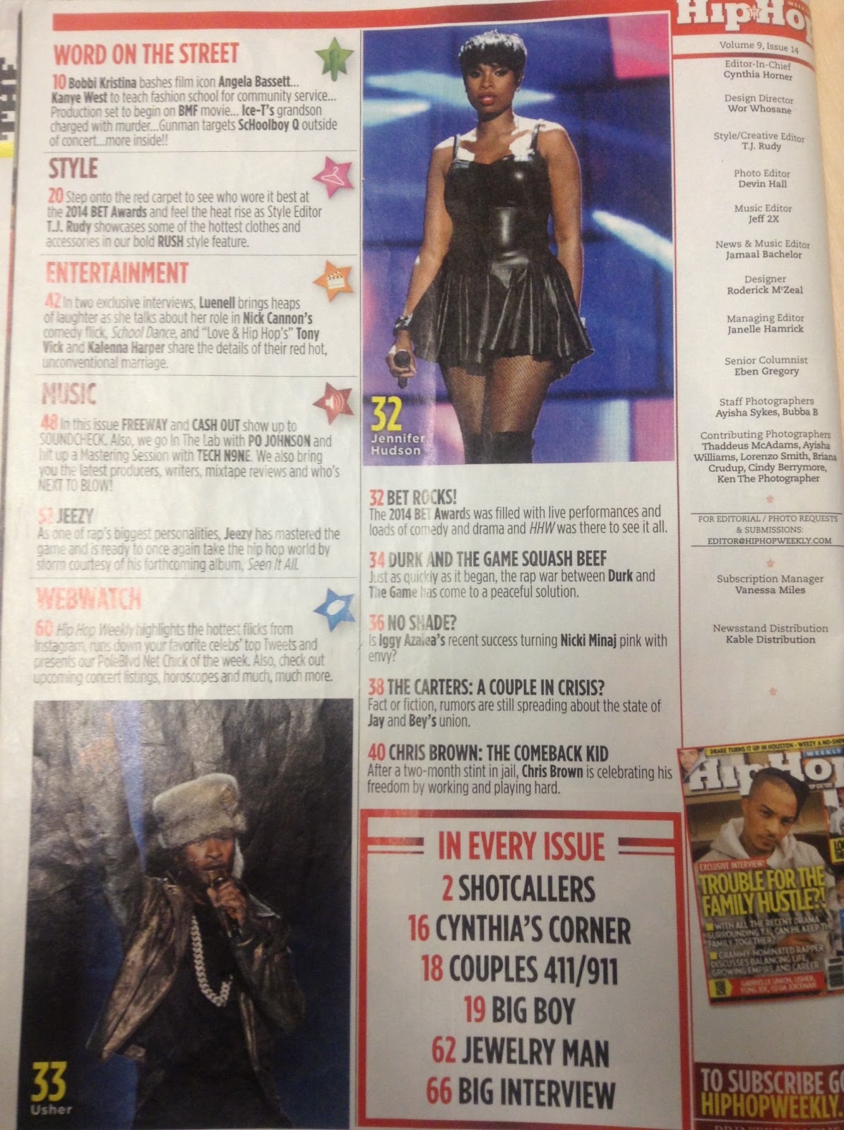
My proposal presentation went really well, the whole class was engaged and they all contributed to the questions related to help me design my magazine. As they was the target audience for my magazine they helped me decide on things like the font that would compliment the magazine colour scheme and the masthead, the title of the magazine, the colour scheme for the magazine and general pictures/camera angles that could be used in my magazine. I also asked them who they would like to see in a magazine so that it is targeted to their age and why this would stand out to them. This allowed me decide on what to include contents page and the double page spread. Asking questions to my class allowed me to keep up to date with new artists and the younger generation. I done further research to find out how much i should sell my magazine for, i asked many people around the college and came to a conclusion of £2.50.
Thursday, 6 November 2014
Wednesday, 29 October 2014
Photography Intro.
Lighting:
When taking my photographs i would be using a 3 point lighting setup using the flash heads (Trinity) which consist of The main light, known as the key light, The fill light to take out the shadows and the hairline light to stop the model from bleaching into the backdrop. This is a 3:1 lighting ratio which means every light would be doing something different. There is a plus (+) and minus button (-) on the lights to change the power of the flash, 1 being the lowest and 6 being the highest. All the lights are connected and has a test button to test the flash type chosen. The soft boxed light softens the light, The snoot is the dented cone which is used to separate the model from the back drop and he Godox which makes all the light communicate in sync. This is battery based.
Camera:
The camera being used is the Nickon D7000 which has 17million mega pixels. The lens has a ratio of 18:135 this means it can extend to zoom. The amera would beep when it is in focus, pictures would not be taken until the beep is heard. Once we have taken our pictures we should download them straight away to prevent time wasting. There are two functions of the lens: 1. Automode (A) this is where you hear a beep telling you the camera is in focus or 2. Manual (M) this is where you have full control and the beep is not needed. When changing the colour of the picture we should go to menu, set picture control and select either standard (colour) or mono chrome (black and white).Model:
The model should stand about 5-6 feet away from the back drop this is to make sure they dont bleach into the backdrop. There are two types of backdrops: whitr and black. The lights should be off when taking your photo. The refkectors could be used on the model to bouce light, there are 3 types: 1. Gold giving the picture a warm tone. 2. White to knock out any shadows in which the flash may present and 3. Silver giving the picture a harder contrast.
Friday, 17 October 2014
Magazine Idea Cover
This is a rough idea of how i want my magazine cover to look like. It would contain a medium Shot or medium close up shot, a black background and a consistent colour scheme of black, white, blue and elements of yellow. the cover would image would be a female to appeal to a wider audience. the main target audience is males due to the colours used.
Friday, 10 October 2014
Subscribe to:
Comments (Atom)


